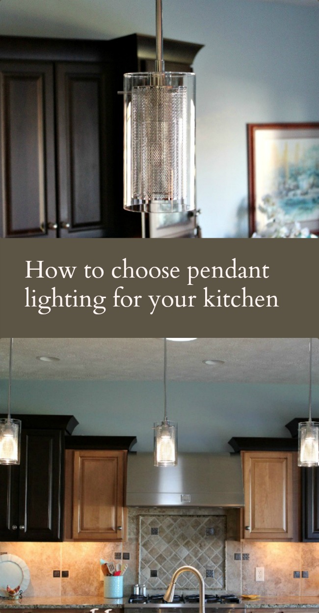
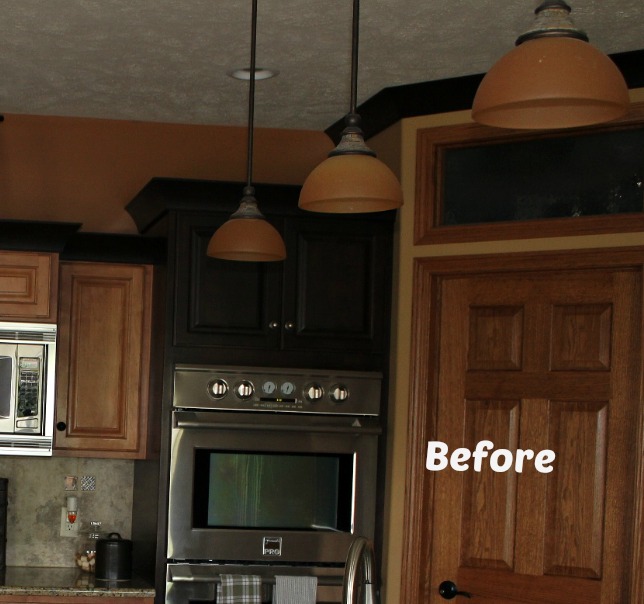
 Updating the light fixtures was a given when we bought this house. The style fit the Tuscan theme the previous owners had going but not the light and contemporary open look we want. The kitchen pendants are one of the first things you see no matter where you enter the living area so they are front and center. Change was due!
It was fairly easy to decide the basics. Like how many pendants and how they were spaced. The current three pendants were well balanced for good task lighting. One is directly above the deep sink and the other two are equally spaced on either side and light the center of the counter below. Keep that. But we needed to change the height at which the pendants were hung. They measured 40 inches from the countertop to the bottom of the light base. Pendants should be no higher than 40” and no lower than 30”. Thirty-six inches above the countertop would put them high enough that the light would not blind Bytes or Wheels, yet close enough to the counter that short me would have adequate light. Good — easy change. Bonus design points: Each pendant would also hang 36’ inches from ceiling to bottom of fixture – one third of the distance from the floor to the nine foot ceiling. Perfect proportion.
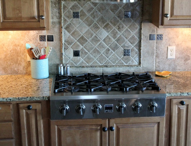
I started a collection of pendants on my Lighting Pinterest board. Beautiful and unique fixtures – stars in their own right – found their way onto the board. That criterion quickly was ditched. The focal point of the kitchen is the stove, strongly patterned tile backsplash and the dark cabinets paired with the light birch cabinets. None of that is going to change. So I added clean lined industrial lighting. What was I thinking? Nothing else in this house is industrial and we wanted to get rid of the dark metal that fought with the dark brown cabinets. I flirted briefly with copper – but no – just no. Pendants with colored shades were out because every thing, including white or cream, clashed with the spotty brown and yellow Uba Tuba granite countertop. The only colored shade exception was the gold we already had—no! Clear glass seemed too harsh – especially when lighted. Shapes were just as hard to choose. Nearly every shape fought with the lines of the dark crown molding. Drum shades, flared shades, coach lanterns – all out of the question because they did not fit the lines of the cupboards or overaccented them. These all illustrate design principles in finding the right size, color and shape that will repeat, accent, harmonize and balance all the other elements. Fortunately – mistakes on Pinterest don’t ruin the budget!
Half-heartedly looking through pendants on Amazon one evening, a description caught my eye. “Stainless steel” lighting, it said. It hit like a ton of bricks and the proverbial light bulb went on! I was only paying attention to the busyness of the tile and countertop, the contrast between the light and dark cabinets with their aggressive angles and sharp changes of height and depth. I had forgotten about the stove, ovens, microwave, sink and refrigerator. At least a third of the vertical surface area!
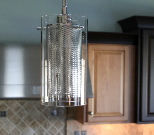
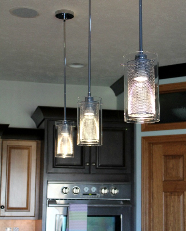
I sat up straight and within thirty minutes found several fixtures that would do exactly what we wanted. Each fixture repeated the stainless steel surfaces, then balanced and softened the look with clear glass over it. When lit in real life, diffused light is all you see, not the materials or their shapes. Unlighted, the shapes that worked best were cylindrical – essentially straight lines when you look straight on so they gently repeated the cupboard lines without clashing with the other elements. The lights, on or off, harmonized with the appliances and cupboards without shouting “hey, look at me.” The fixtures we finally chose were also a good visual scale for the space – 8” long for the glass shades and 4” in diameter.
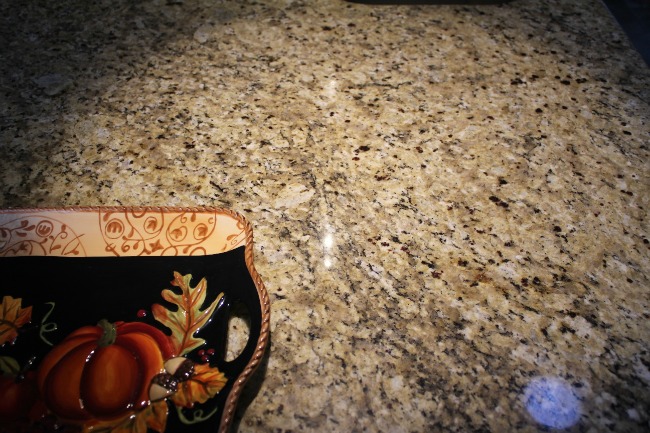
Wheels installed them yesterday afternoon. Using the LED bulbs recommended was another bonus. The bright blue based light they give brings out white and cream in the Uba Tuba granite. Who knew those colors were even there?? The countertop looks lighter and less spotty! I actually had enough light to enjoy making chicken pot pies for dinner on the counter. It’s focused task lighting but gives a welcoming ambience to the kitchen area – both were lacking with the old heavy lights with the thick dark glass shades. The visual space from the living area is so much more open and airy and the entire living space looks and feels much bigger. SUCH a difference!
I’m so glad you stopped by today! Be sure to follow A Pinch of Joy so you don’t miss a thing! I’d love to have your company on this venture!! Follow: Facebook / RSS feed / bloglovin’ / twitter and pinterest. Share: if you found this helpful or inspiring please click one of the buttons below! Your support of A Pinch of Joy is appreciated!
Discover more from A Pinch of Joy
Subscribe to get the latest posts sent to your email.

 Welcome! I’m Charlene. I love to share quick and easy recipes, whatever I’ve learned in our last DIY project – anything that helps make life easier, better and more fun!! I hope you will find inspiration and add a pinch of joy to your day!