
How to make old art new again. And make it coordinate with new room colors. And do it quickly, easily and at almost no cost. That was the challenge in our dining room makeover.
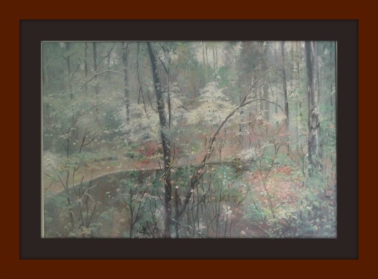
I found this picture at a garage sale a few years ago. Someone was selling off the almost new contents of their office, including artwork. This reminded me of a spot in one of our favorite hiking areas, a place called Highbanks, in the spring time. When I got it home, the title of the piece is “Spring”. It’s pretty good sized – 48 inches by 38 inches – and very heavy. For a while it hung in the living room. However, a perfect spot opened up when we did the dining room. Except the mat colors made it look way too heavy for the light, airy and meditative vibe I was going for. Plus I didn’t think they really conveyed “Spring”.
So I unceremoniously turned the picture upside down on the dining room table and began to disassemble it. I had pictures but when we changed computers last fall, those photos were among the missing. I did edit in the mat colors below so you can see how dark it was.
I experimented with the color swatches for several days, trying different combinations to pick up different portions of the picture. I really liked the one that picked up the orangey color, but again the over all effect was not the serene feeling I wanted. Finally I decided to go with the wall color and the color of the adjacent hallway. They didn’t jar or call attention to themselves and blended with both the wall color (since it IS the wall color) and the colors in the picture.
I carefully removed the dust cover so I would be able to reuse it. Some are stapled on, the better ones are glued and a little tricky to get off in one piece. A sharp thin knife helps. Then I slipped out the mats, being very careful not to let them bend and become nicked or creased. I placed them on a tarp on the garage floor, which was the only work place big enough to hold them both flat.
Then . . . .the secret to new mats that are quick, easy and no cost. Drum roll please.
The very same paint that was used to paint the walls. Yes, just latex paint. I used a small roller just wide enough to cover the entire mat and quickly did a light coat of their respective colors to seal and prime the mat itself. When that dried in about 30 minutes. I came back with another coat. Thirty minutes later a third light coat. I let them dry over night to be sure they were thoroughly dry and would not stick to one another or to the glass.
I carefully cleaned the inside of the glass (and missed one fingerprint at the bottom that no one else can see but that screams at me!). Then I reassembled the entire thing, following exactly the same steps as in disassembling except in reverse. The hardest part was getting the dust cover on straight and in one piece, but even that was fairly easy. There were so many options for color choice, but I like this one because it flows with the strong wall color and does not compete with the wall or the picture. That lets the print speak for itself.
It does that and quite clearly too. When my friend saw it, she exclaimed “Oh, that’s the spot in Highbanks where we go hiking.” I don’t know if the artist even knew Highbanks existed when he painted it. But it was great to know that the print elicited the same positive thoughts of hiking on a beautiful spring day in at least two people. Art that speaks to people!
I’m so glad you stopped by today! Be sure to follow A Pinch of Joy so you don’t miss a thing! Subscribe by email on the sidebar or follow on Facebook, bloglovin’ twitter and check out my pinterest boards. If you found this helpful or inspiring please share below! Your support of A Pinch of Joy is appreciated!
Discover more from A Pinch of Joy
Subscribe to get the latest posts sent to your email.

 Welcome! I’m Charlene. I love to share quick and easy recipes, whatever I’ve learned in our last DIY project – anything that helps make life easier, better and more fun!! I hope you will find inspiration and add a pinch of joy to your day!
Donna Huisinga says
Great idea. I saw it at Clean and Sensible. I am confused though. The frame looks different too or are those 2 mats in the bottom picture? They are different size than the top too.
Charlene says
Sorry for the confusion! The frame stayed exactly the same, the mat colors changed from the brown and gray depicted in the second picture. We lost photos when we switched computers so I did a quick edit of the photo to show the old colors of the mat. Just wanted you to see what a difference the mat colors made in the mood of the picture! And ultimately of the entire room — full reveal coming soon!
Charlene recently posted…Cheddar Chunk Green Pea Salad